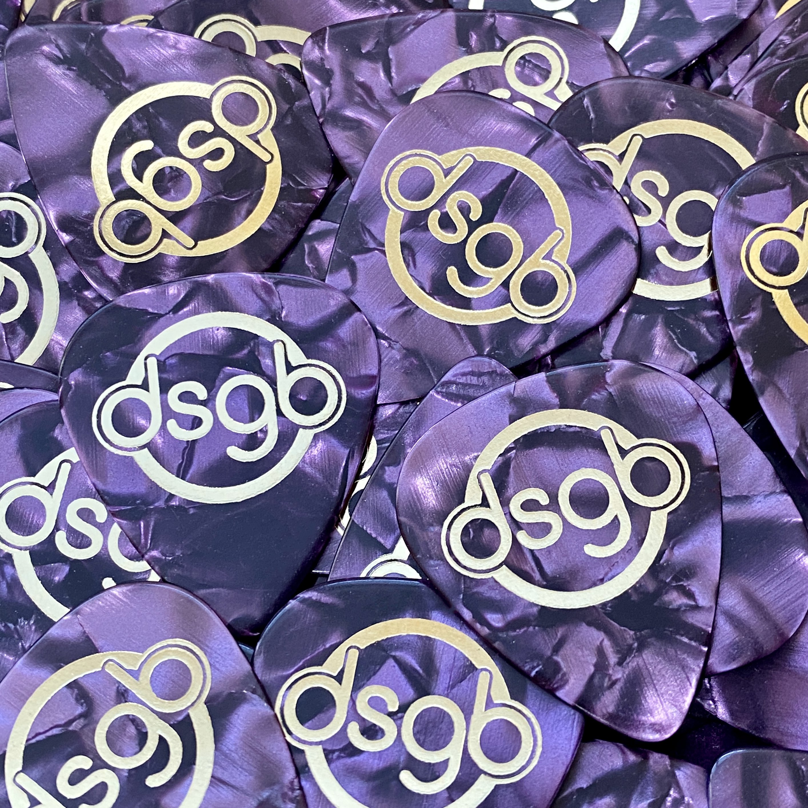
Thanks to Dan at http://www.mybadges.co.uk/ in Southampton, U.K. for these lovely purple celluloid metallic hot foil printed custom guitar picks. I have had a passing interest in graphic design since school, having studied art at GCSE level so launching this website offered the perfect opportunity to design a distinctive and meaningful logotype for myself. This is not as straightforward as it seems but it was the first activity I engaged in after registering the domain name with WordPress in October 2020.
My original idea was to use a simple circular theme to suggest an acoustic guitar sound hole and the decorative ring that usually adorns it. I also wanted to suggest guitar strings somehow so I selected a rounded, bold sans serif typeface that would work well with the circular theme and lend itself well to the filled double outline style. I realised that if I used the lower case four letter abbreviation for Doug Short Guitar Blog, the letters “d” and “b” would confer some symmetry on the logotype. Given that the letters “g” and “b” also represent Great Britain (U.K.) where I am based, I hoped that the overall appearance would evoke the roundel style thematic element used on the most iconic urban transportation system in the world, the London Underground.
I chose the colour simply because I find a wide range of hues on the purple part of the visible spectrum to be the most appealing. I actually prefer lilacs but not many objects (including clothes, cars, guitars, walls in your home) look tasteful in those hues!
The initial scoping was done using the excellent software utility Logo Design Studio Pro from SummitSoft. I then transferred to TurboCAD to design simplified and negative variants of the logotype for scaled down applications such as printing onto small items and for internet avatars. Although the simplified “white-on-purple” design loses the double-outlined suggestion of guitar strings element, I now prefer the boldness and simplicity of it to the original.